About a month ago, I saw the trailers of TMNT: Out of the Shadows, and saw that the Turtles still looked the same for the most part, differing only slightly in height and mask color. I thought, back then, why does it have to be that way? I started watching Nickelodeon’s TMNT 2012 series, and the same thing bugged my mind. Is there no other way to depict the turtles? I did not know the answers to these questions.
I instead asked: What would I do with the Turtles, if I were to design them? So I started sketching out concepts to increase their individuality. These four Turtles, although raised together as brothers, each have their own personality that makes each so different from every other Turtle. I looked at their personalities and habits as the anchor for my designs, and tried to reflect that in their body type and posture.
Body Type and Posture

Raphael is the hot-headed fighter of the bunch. He is usually very aggressive and angry about everything the Turtles go through. So I depicted him as the brawler. I thought, he must be really good at fighting, especially with his bare hands. It’s not that all the other Turtles are weak (they’re not, Splinter made sure of that), but Raph has to have more raw power in his body than everyone else, and so I beefed him up a little bit. I made his torso wider and his height shorter to make it easy for him to find his physical center, making him look more stable and firm. I also added a cracked shell (Nickelodeon’s Raph has this one already), depicting his carelessness couple with his love of fighting. Always so sure of himself and his actions, I imagined him as the stubborn and immovable Turtle, so I put him in a proud stance.
Donatello, on the other hand, is the smartest in the group. It’s not that he can’t fight (Splinter made sure of that, too), but he prefers to use his intellect and strategy in a fight, avoiding physical conflict as much as he can (or as much as his other brothers allow him to). As the inventor of the group, he also creates gadgets and machines, like the Shellraiser, that will benefit in their crusade. So I gave him the intellectual body archetype, tall and slender. He looks to have the least power among the Turtles, but his intellect more than makes up for any power he lacks. I also imagine him having the least confidence among the Turtles, so I gave him a slouching, unsure pose.
Michelangelo is the joker of the group. He is regularly treated as the most immature brother. He always incorporates fun and games in his actions. He loves pizza and… break-dancing? So I imagined him as the quickest in the group. His body has to be fast enough to fight and insert pranks in between. I gave him a short body type that can easily handle fast and agile movements. Being the youngest, he is always energized and ready for a fight, so I gave him a pose that reflects his aversion to staying idle.
Leonardo is the leader and arguably Splinter’s favorite son and student. His physical abilities are more well-rounded, compared to the other Turtles. No clear physical focus, compared to his other brothers. So I gave him a well-rounded body type: not too big, or too tall, just somewhere in between. Leo’s strengths lie, instead, in his talent for looking far ahead, and his decisiveness in stressful situations. As the most obedient student of Splinter, I also imagine that he takes his training serious more than any of his brothers. So I put him in, what I imagine, a stance an obedient ninja student would take.
Attire
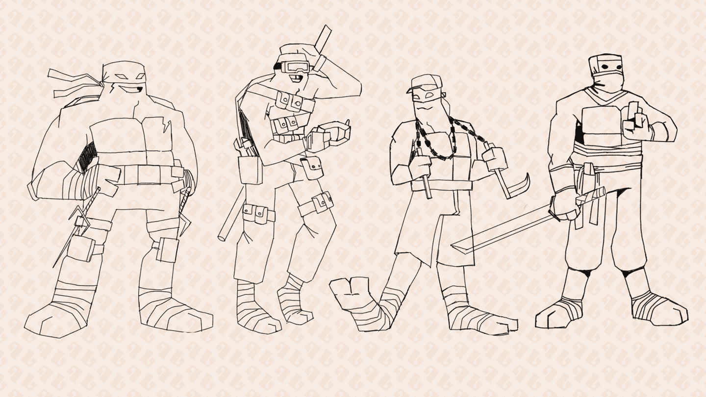
Taking all this into consideration, I decided to push my direction further with attire. I wanted to add another layer of design by adding clothes to the characters so I decided that I did not want the Turtles “naked” as they usually are (just shells, bandage, padding and the same attire for everyone). I also tried to consider they live in the sewers, and most of any kind of attire they will have will probably be discarded items from surface-dwellers.
Raphael, being the brawler, would not mind keeping it simple. Being the most physically active Turtle, I made it simple for him so nothing gets in the way of his attacks, but not too simple that there is barely any depth to his attire (we’ll get to that later). Knee and elbow pads could help make it easier for him to fight.
For Donatello, I wanted to exaggerate his attire a little. I gave him lots of pockets for him to put his small inventions in, letting him carry all the tech he wants to to the field. I looked to Kim Possible, another cartoon I liked when I was younger, for inspiration.
Michelangelo, as stated before, likes dancing, so I pushed that a little further: what kind of music would he dance to? I decided on some genres like Hip Hop and RNB, looked for inspiration there. A particular artist I focused on was Billy Crawford (Big City Era, around 2004-2005). I’ve seen him on TV as child, and his image just stuck to me. A bandana under a cap on his head? That’s just ridiculous. So ridiculous that I just had to put it on Mikey. I also used the chains of his weapon the same way Hip Hop artists are fond of using their chains: around their necks.
For Leonardo, some simple ninja pants and a ninja mask made of rags was enough. I changed this version in the final art to something that shows the rags clearer.
All that’s left now is to color it up.
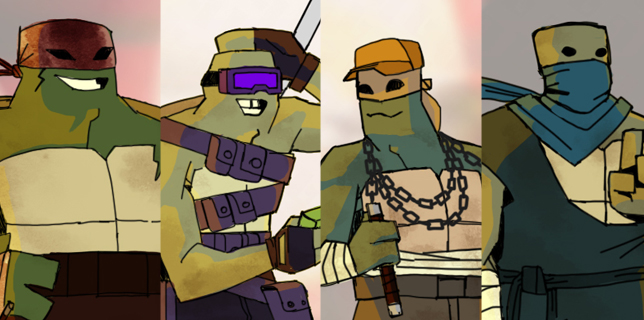
Color and Texture
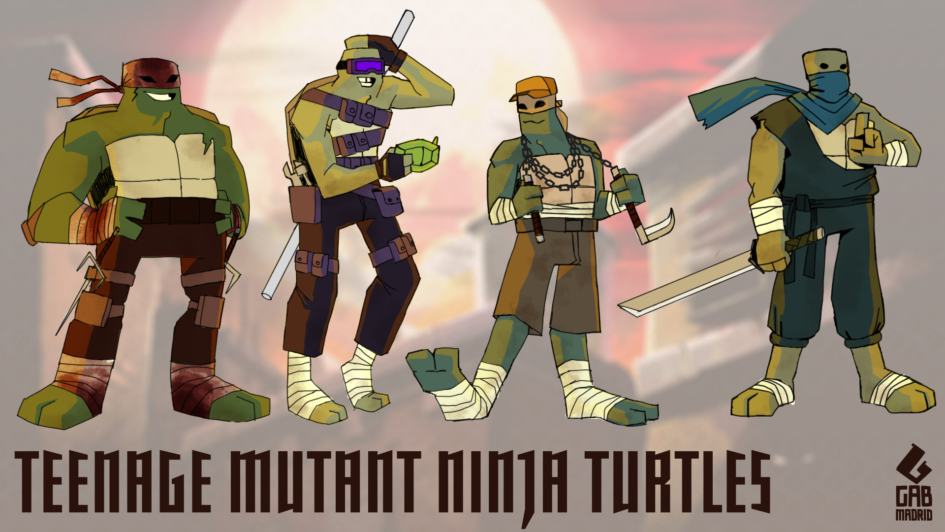
Color and Texture both add another layer of design to the characters. The Turtles still keep their respective original colors, BUT their colors are not traditionally placed on a single piece of clothing that they all have (e.g. a mask).
I used Raphael’s color as a sort of lingering story device for his character (huh? whut? idk). We see that his mask is not originally red, but is red due to bloodstains. This reinforces his love to fight, implying that he also shows off the fact that he has been through a handful of intense fights, treating the bloodstains as some kind of trophy for the fights he’s won. (Who’s blood could it be, though? The Kraang? The Foot? Shredder himself? His brothers?)
Donatello’s color is applied most prominently on his goggles. The goggles are colored in a way that it looks like it lights up like a pair of Night Vision Goggles that Don created from normal goggles, and uses it to see better in dark places.
Not much to say about Michelangelo, except that his color is featured prominently on his cap, instead of usually on the mask.
I tweaked Leonardo’s attire a little bit. The previous iteration (see Attire above) did not feel complete or adequate, so I added an upper garment, and changed the mask to make it less actual-ninja-looking, and more This-is-some-rag-I-made-into-my-mask. I also added a long tail, like a scarf is attached to the mask, a la Strider Hiryu. It could be longer.
Conclusion
I realized, in the middle of doing this exercise, that animating these characters with this level of detail would be hard to animate in the first place and, more importantly, sell to kids. Incidentally, both of which are, I believe, sensible and likely reasons a studio like Nickelodeon could have for not deviating as far away from the original designs as I have.
Maybe I can do a version somewhere in between: A simpler version for a children’s cartoon, but with the same direction of individuality between the Turtles. Hmmm…